Kitchen & Bath Renovation - 211 East 53rd Street
Transformed a Classic Manhattan Layout Into a Modern Space
The Strategy: Respect the Layout, Upgrade the Experience
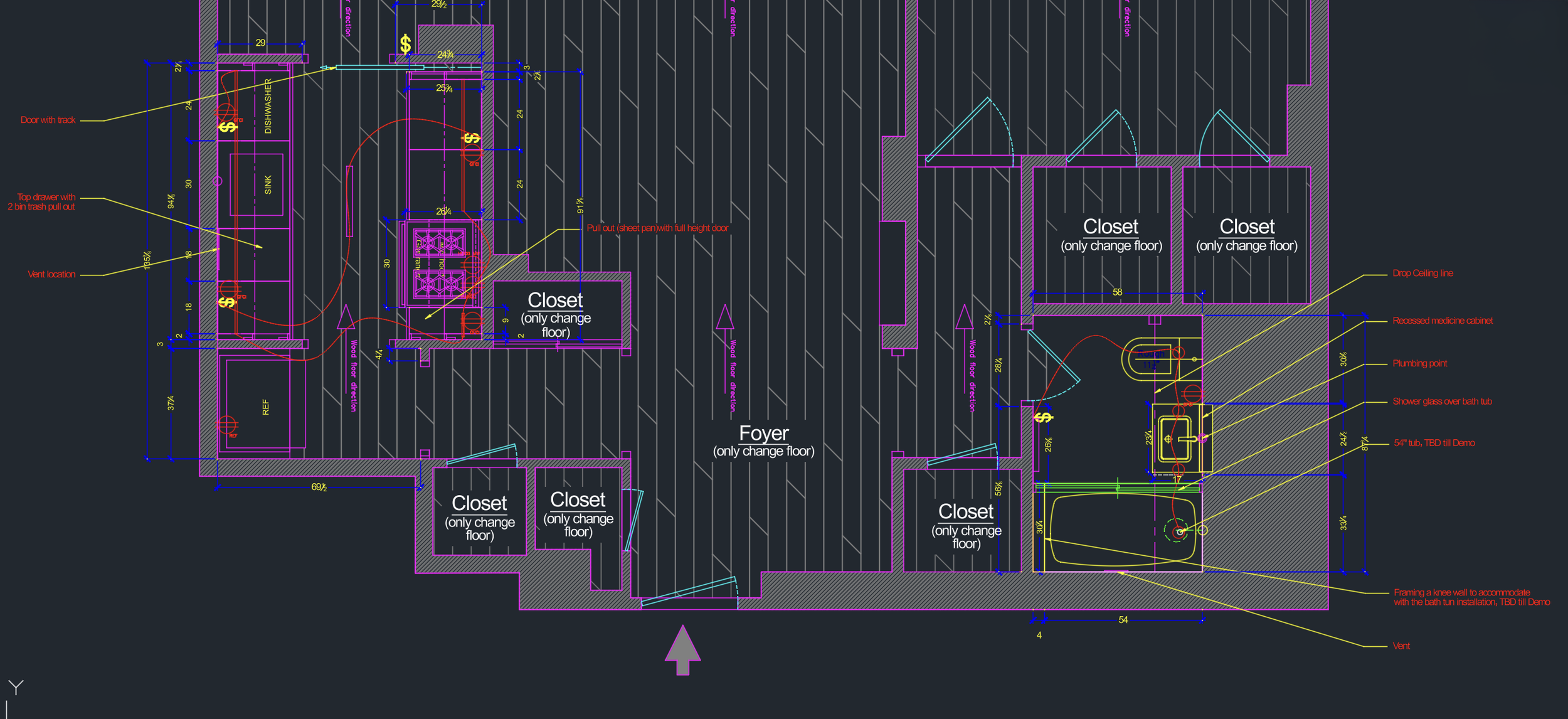
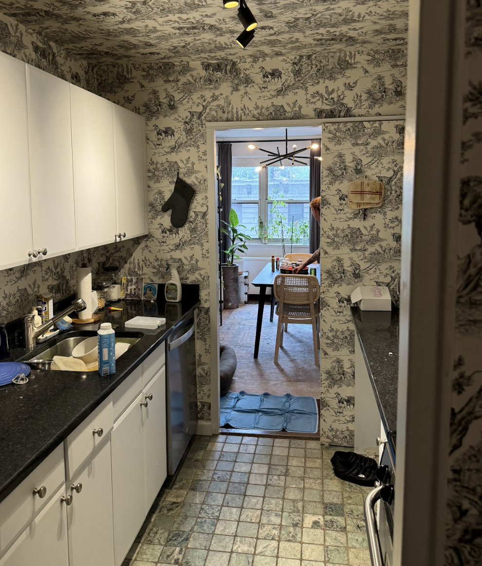
In a co-op building like this one, altering the footprint isn't always on the table — and frankly, it didn't need to be. The existing layout was efficient. The galley kitchen worked. The bathroom had the right bones. What this apartment needed wasn't a new floor plan. It needed a new identity.
When clients come to us with a well-located Midtown apartment and a clear directive — keep what works, elevate everything else — that's honestly one of the most satisfying briefs we can receive. No gut renovation drama. No DOB filing headaches from moving plumbing stacks or reconfiguring load-bearing walls. Just sharp, disciplined design decisions executed with precision.
This project at 211 East 53rd Street is exactly that kind of work. And the result speaks for itself.
Our approach was straightforward:
- Preserve the layout entirely
no structural changes, no plumbing relocations
- Introduce new pre-finished solid hardwood flooring
throughout
- Execute a full paint refresh to modernize the palette
- Gut and redesign the bathroom
with a brighter, more editorial material story
- Fully renovate the kitchen
with custom cabinetry, new countertops, appliances, and lighting
Simple in concept. Demanding in execution. That's how we like it.
The Floors: The Decision That Changes Everything
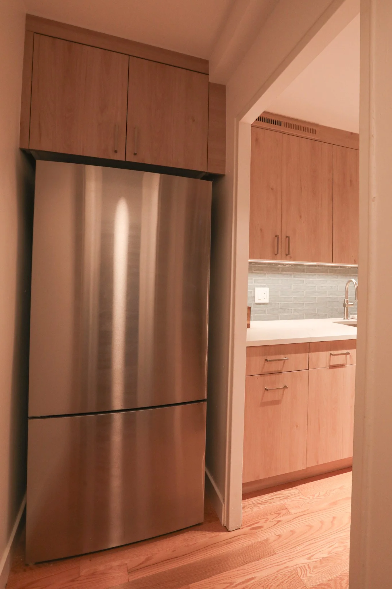
If there's one renovation move that transforms the entire feel of a New York apartment more than any other, it's the floors. We specified pre-finished solid hardwood in a light natural oak tone, and it was the right call for this space without question.
The warm honey tone of the wood works in direct conversation with the kitchen cabinetry — they share the same family of tones without being matchy. It brightens every room, makes the ceilings feel taller, and gives the entire apartment a cohesion that didn't exist before. Pre-finished solid hardwood also means no finishing fumes during the renovation — a significant consideration in a co-op building with neighbors and building management watching the schedule.
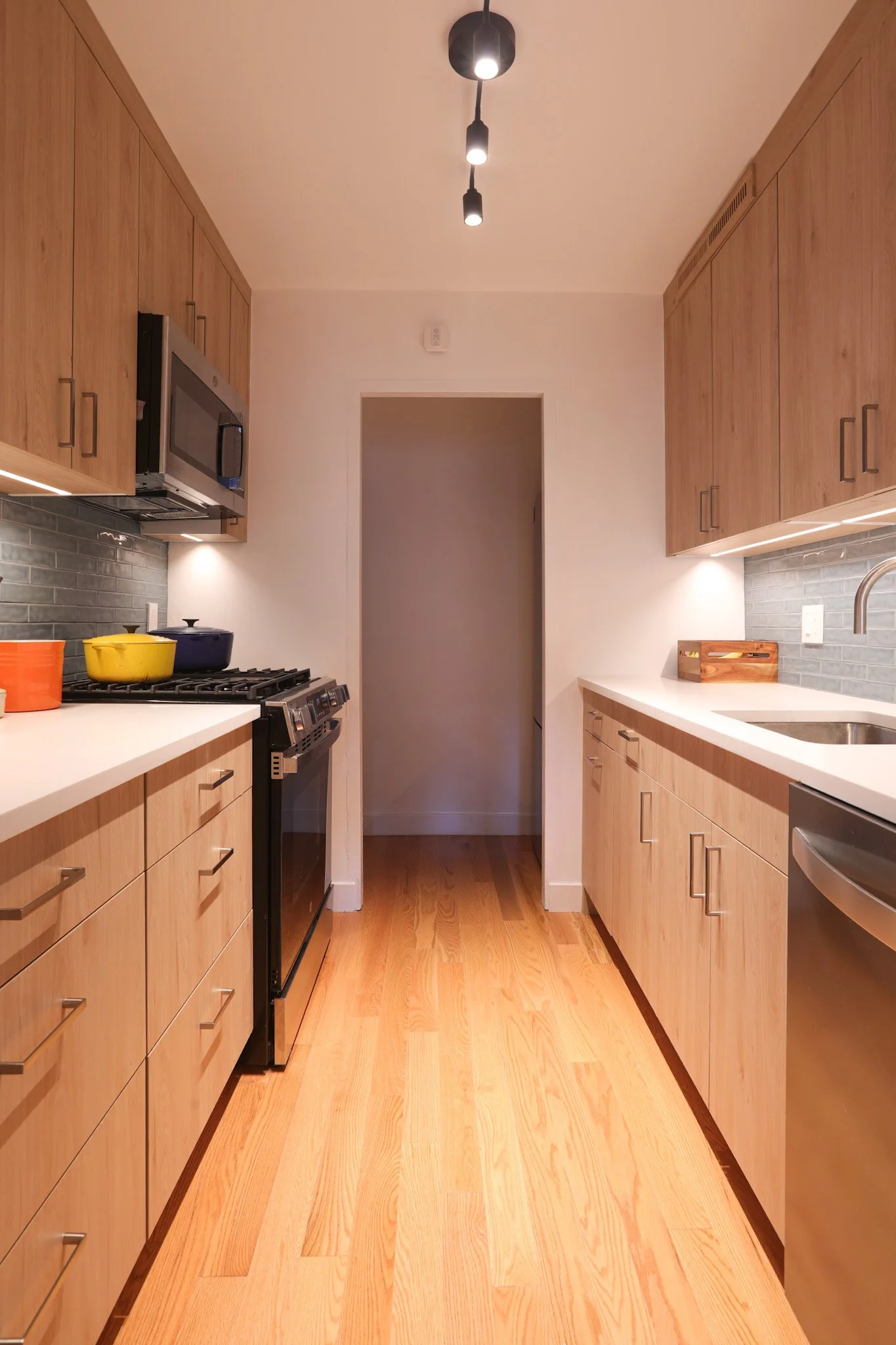
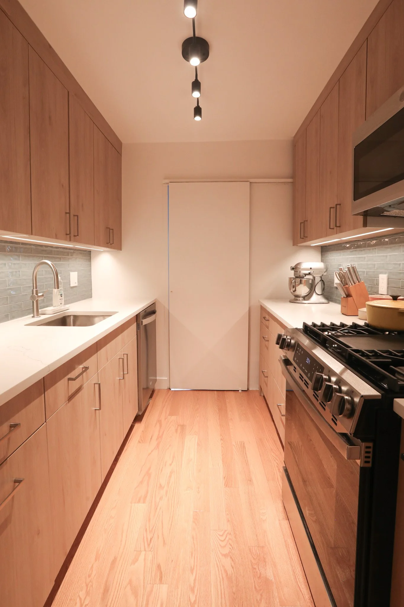
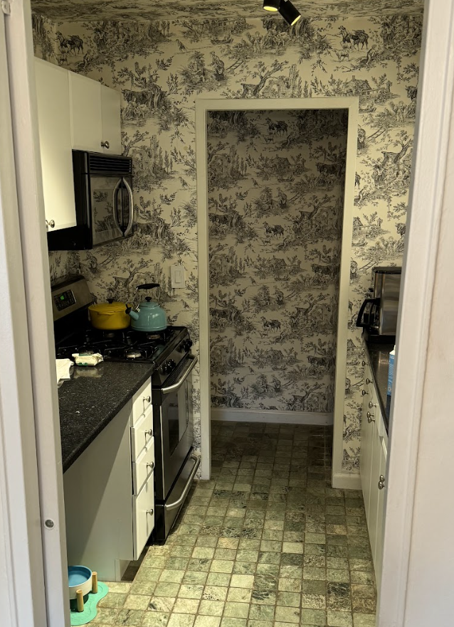
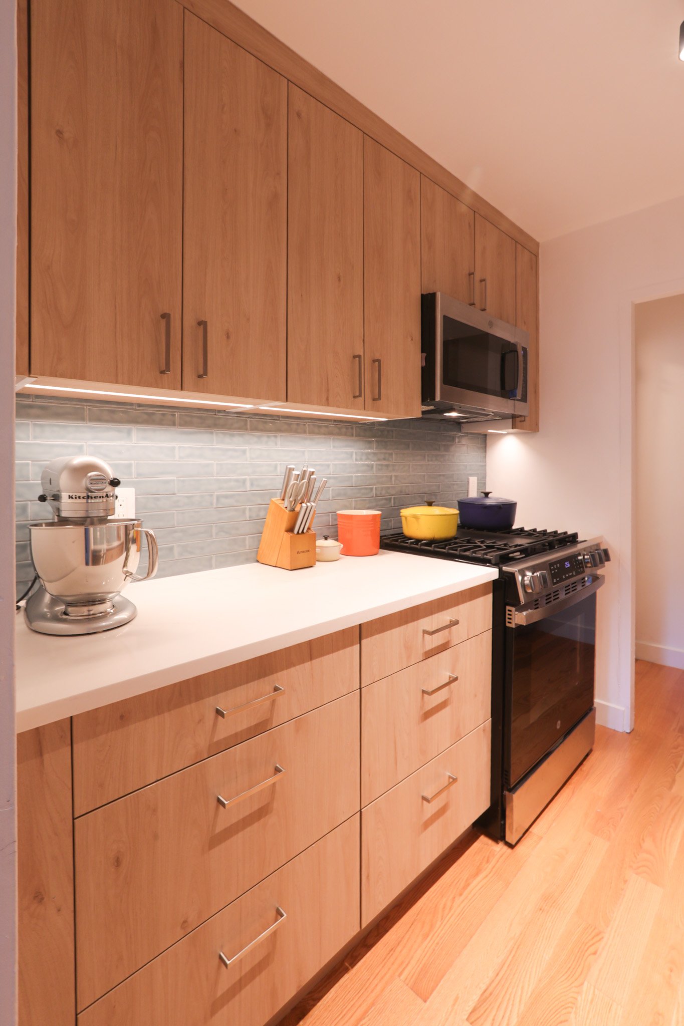
The Kitchen: A Galley That Actually Performs
Galley kitchens get a bad reputation in New York real estate, but when they're designed correctly, they're among the most functional kitchen configurations available. The key is maximizing every linear inch — and that's precisely what we did here.
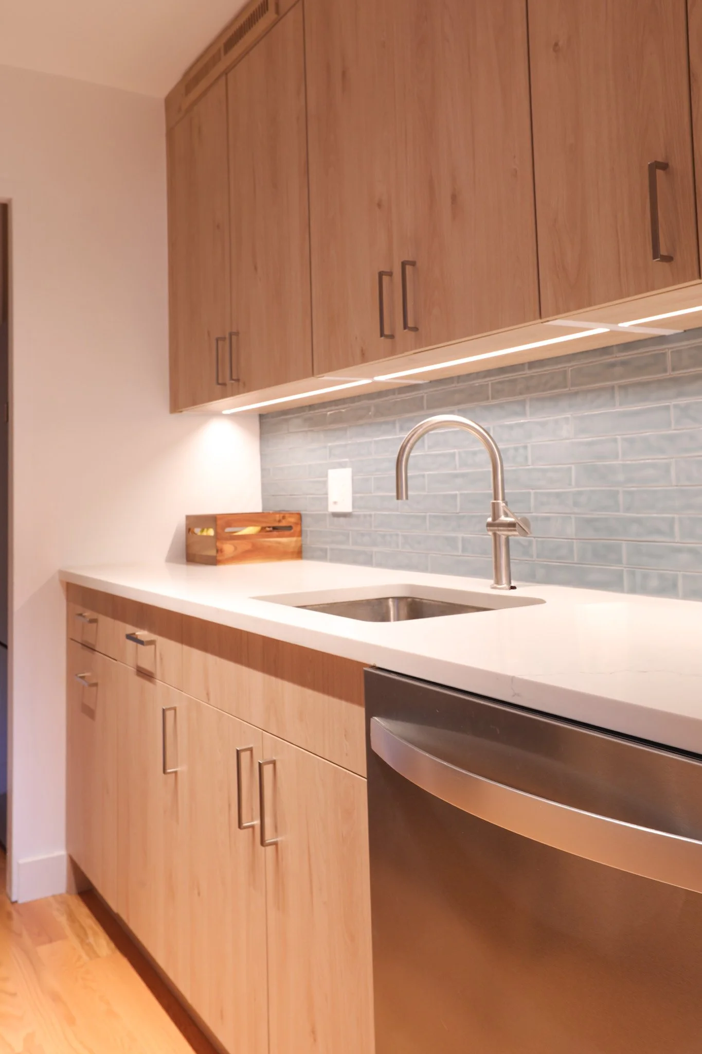
We spec'd flat-front cabinetry in a warm natural wood tone, running floor-to-ceiling on both sides of the corridor. The grain is consistent, the finish is matte, and the hardware — simple rectangular pulls in a brushed nickel — keeps the eye moving without interruption. This isn't a kitchen trying to be a showroom. It's a kitchen built to be used.
The countertops are white quartz with a clean, tight edge profile — durable, maintenance-friendly, and visually expansive against the wood cabinetry. The backsplash is a soft slate-blue elongated subway tile, laid in a running bond pattern. That color choice was deliberate. It reads as neutral at a glance but introduces depth and just enough personality to make the space feel considered rather than generic.
Under-cabinet LED strip lighting runs the full length of both walls, providing true task illumination at the counter surface — something that was clearly missing in this apartment before. Above, we installed a multi-head pendant track light centered on the ceiling axis, giving the cook directional light exactly where it's needed most.
The refrigerator was repositioned just outside the galley corridor in a dedicated nook, flanked by custom cabinetry that extends to the ceiling — capturing every last inch of vertical storage that NYC apartments demand. Stainless steel appliances throughout — gas range, over-the-range microwave, and dishwasher — tie the material palette together without competing with the cabinetry.
The result is a kitchen that feels significantly larger than its square footage suggests, functions without compromise, and looks like it belongs in a $3M apartment.
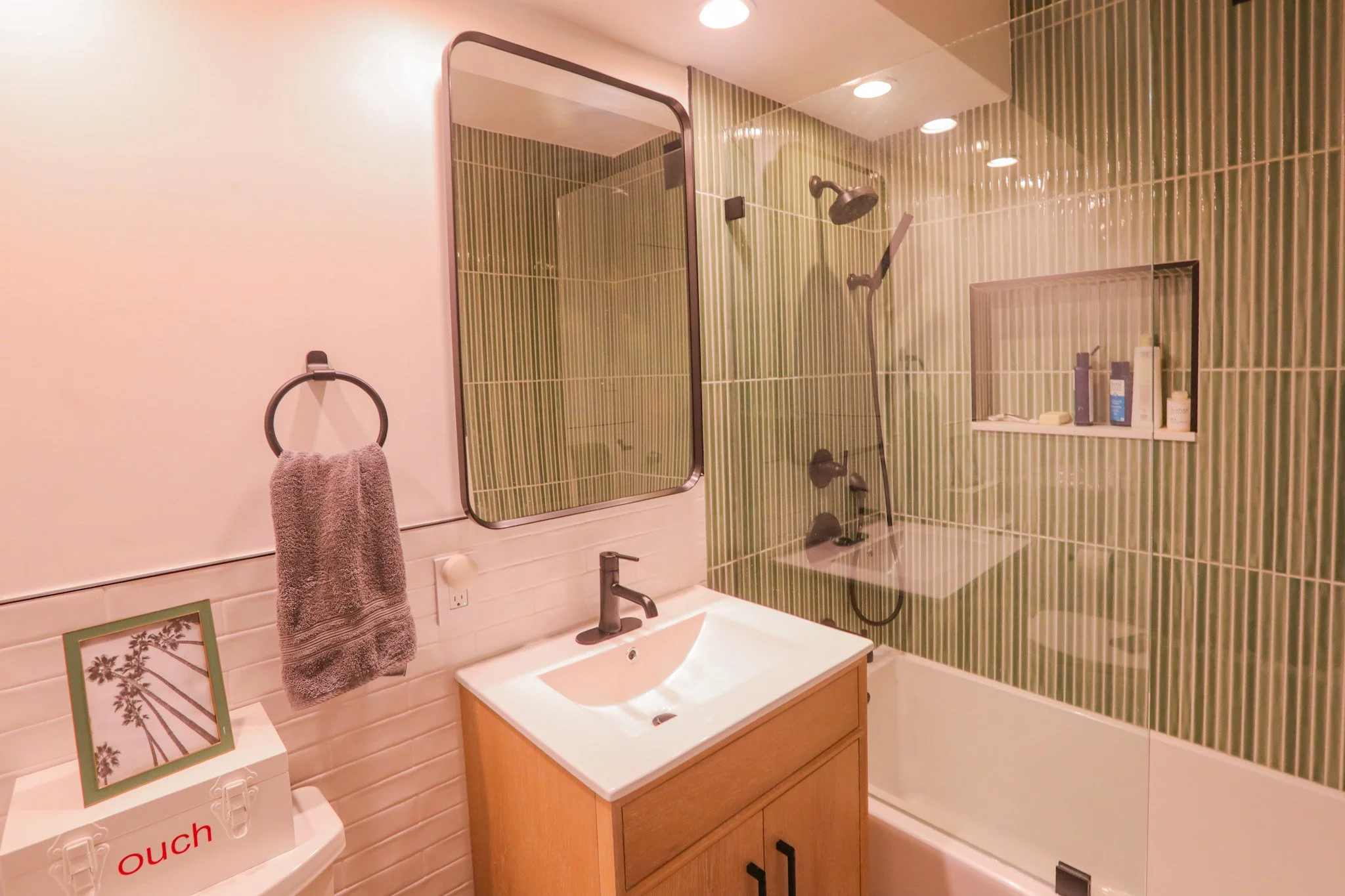
The Bathroom: From Dated to Destination
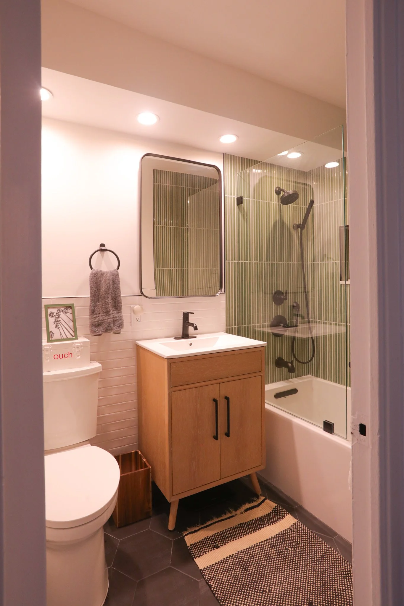
This is where the project gets genuinely exciting.
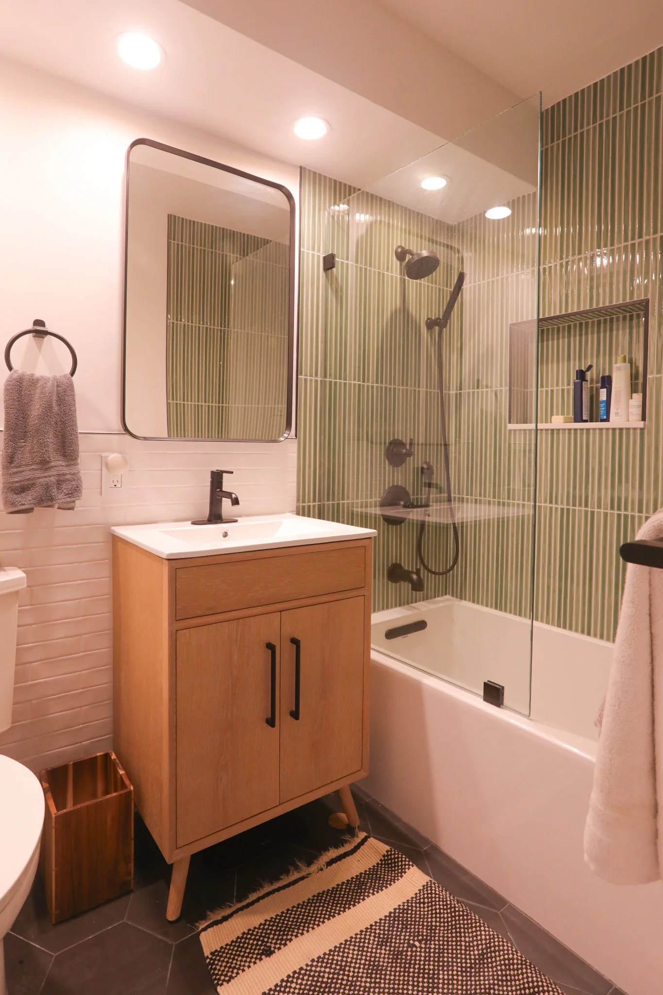
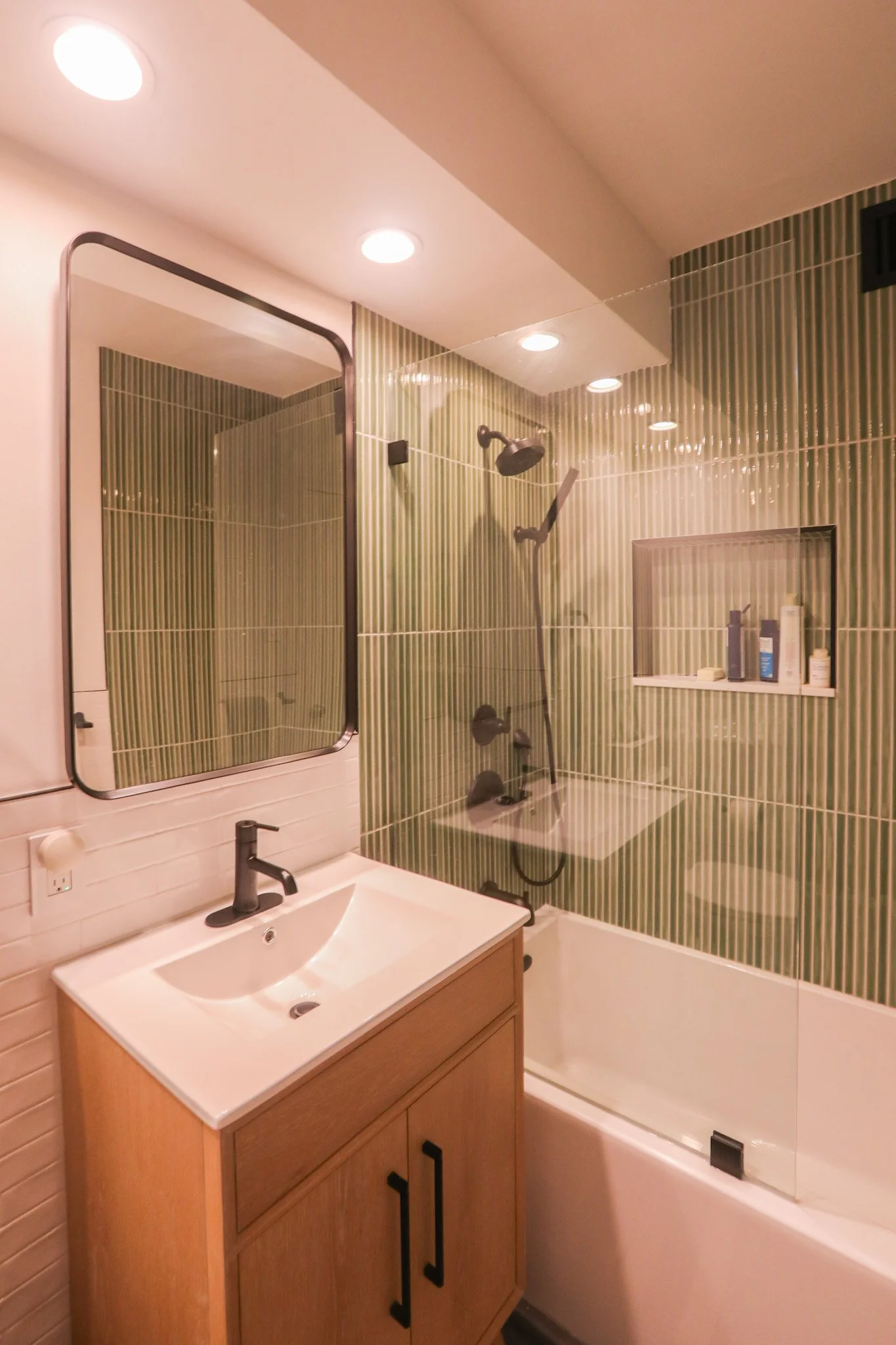
The brief called for a brighter material combination and — notably — a tub/shower conversion, which is increasingly rare in Manhattan apartment renovations. Most clients are moving away from tubs. This client was smart enough to recognize that a proper soaking tub, done well, is both a lifestyle upgrade and a resale asset in a building like this.
We kept the tub-in-alcove configuration but upgraded every single element around it. The shower surround is clad in floor-to-ceiling vertical green ceramic tile — a narrow, ribbed-profile tile that creates an almost textile-like surface quality. The vertical orientation draws the eye upward and makes the ceiling feel higher than it is. The color — a soft, muted sage — is one of the stronger design moments in the entire apartment. It's bold without being aggressive, and it photographs beautifully.
The frameless glass shower panel keeps the visual boundary between tub and room as light as possible. A built-in recessed niche, tiled to match, provides functional storage without interrupting the wall plane.
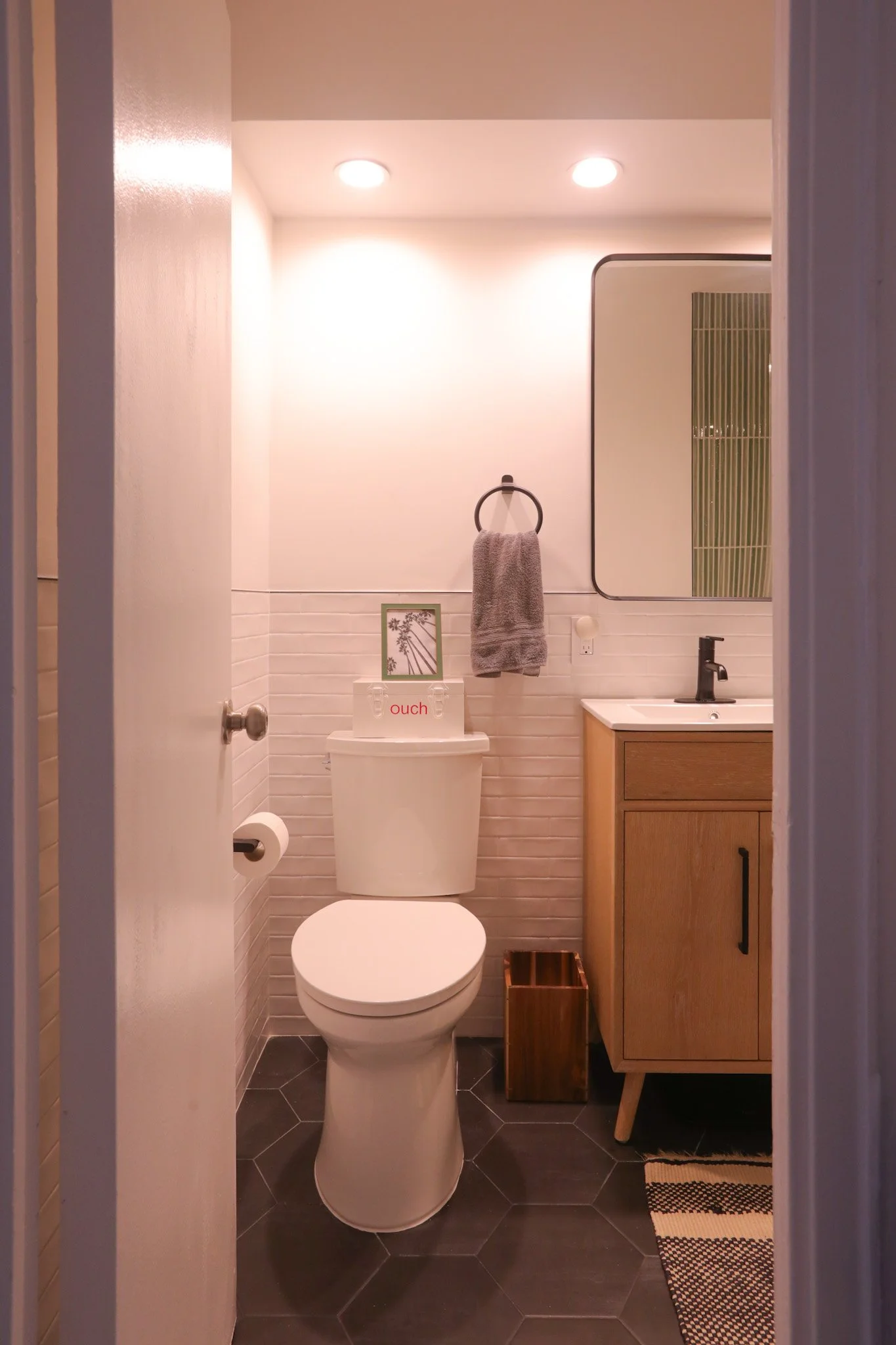
For the vanity side of the room, we chose a mid-century inspired wood vanity with tapered legs — a deliberate departure from the wall-mounted or built-in look. The legs keep the floor visible, making the bathroom feel less claustrophobic. The matte black faucet and hardware throughout — towel ring, toilet paper holder, shower fixtures — create a consistent metal moment that grounds the warmer wood and green tile tones.
The lower wall tile is a white beveled subway brick laid in a running bond — a classic that works precisely because it doesn't compete with the dramatic shower tile above the datum line. The floor is large-format dark charcoal hexagon tile, providing contrast at ground level and a visual anchor for the room.
Overhead, recessed can lighting is positioned to wash both the vanity and the shower enclosure evenly — bright, flattering, and fully code-compliant with required wet-location ratings.
The rounded-rectangle mirror with a matte black frame ties the hardware story together and reflects the green tile behind it, which creates a layered, almost gallery-like quality when you enter the room.
Projects like this one at 211 East 53rd move efficiently when the scope is clean and the contractor coordination is tight. We managed all building management communication, alteration agreement compliance, and scheduling to protect our client from the friction that typically slows these projects down.
No wet over dry violations. No unapproved plumbing changes. No surprise violations at move-back. Just a clean, permitted, professionally executed renovation that added real value to the apartment.
Not every renovation needs to be a gut job. Sometimes the highest-ROI move is knowing exactly what not to change — and bringing everything else up to the level it should have been all along.
This apartment is proof of that. Same footprint. Completely different apartment.
Ready to talk about your space? Let's get started.
G Project Design Studio | New York City Interior Renovation
Specializing in kitchen, bathroom, and full apartment design across Manhattan and the outer boroughs.
***Construction work is Held by KBR design and Build
***Designer : Chiayi (Edison) Liao
***Project manager : Andreas Tesko